Invisible Voices
This is an MA final project, so bear with me.
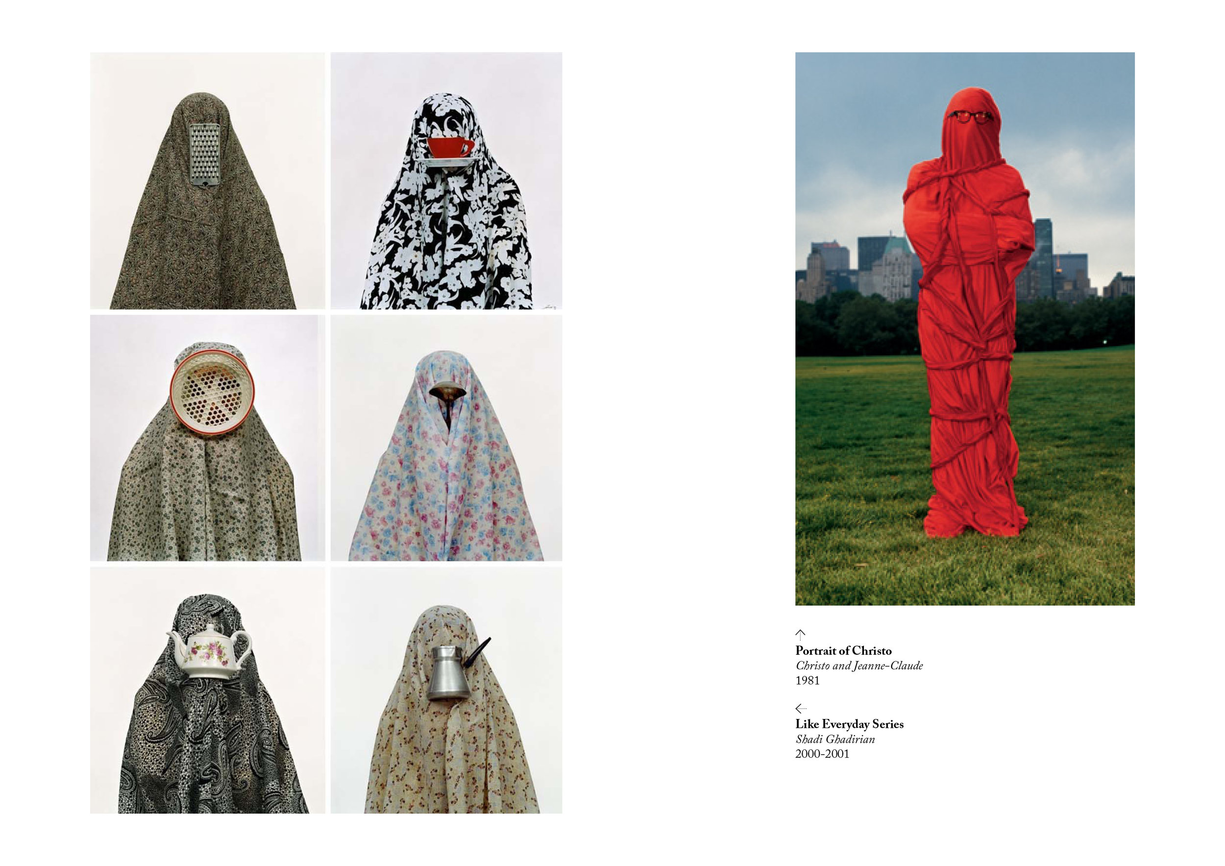
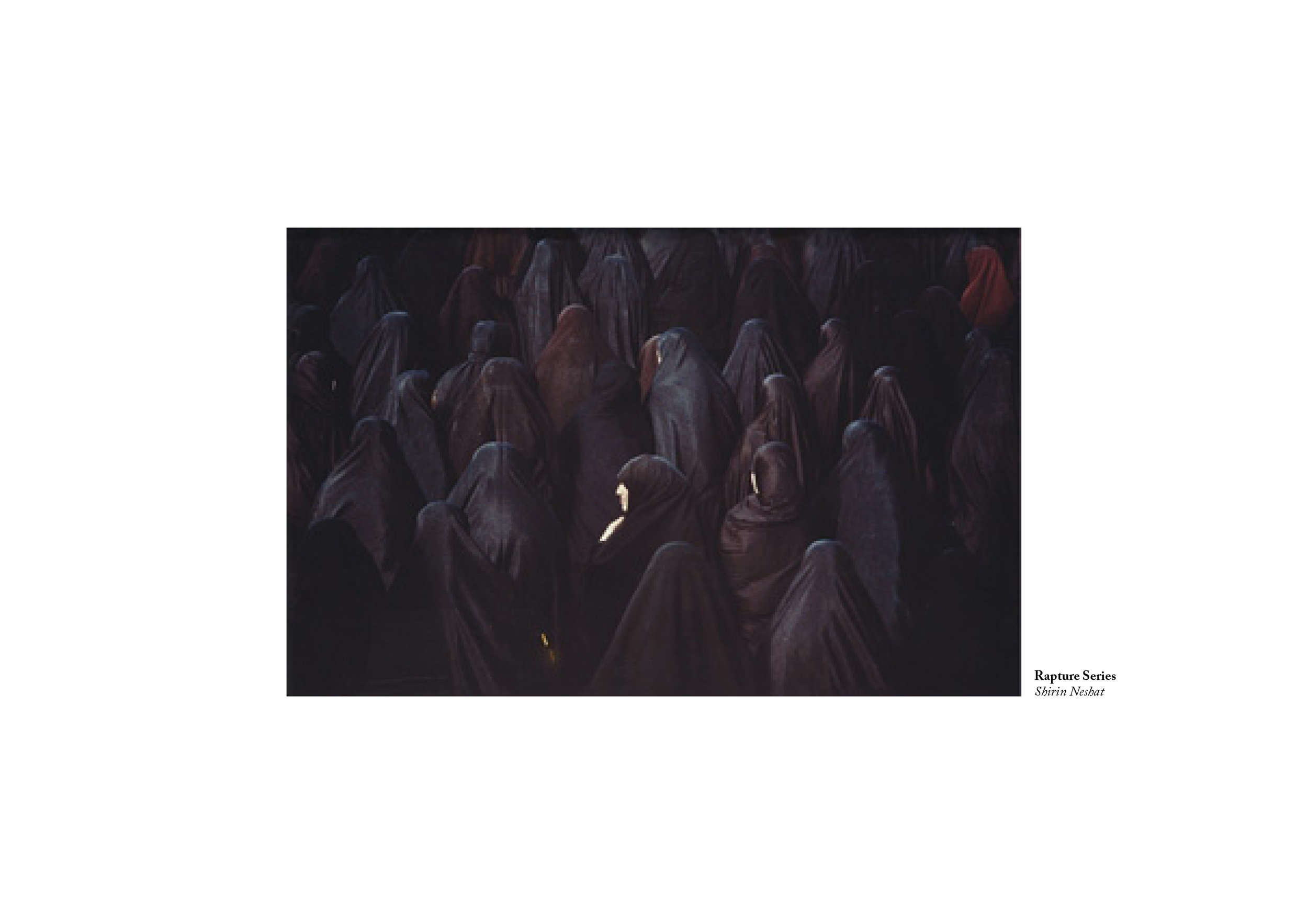
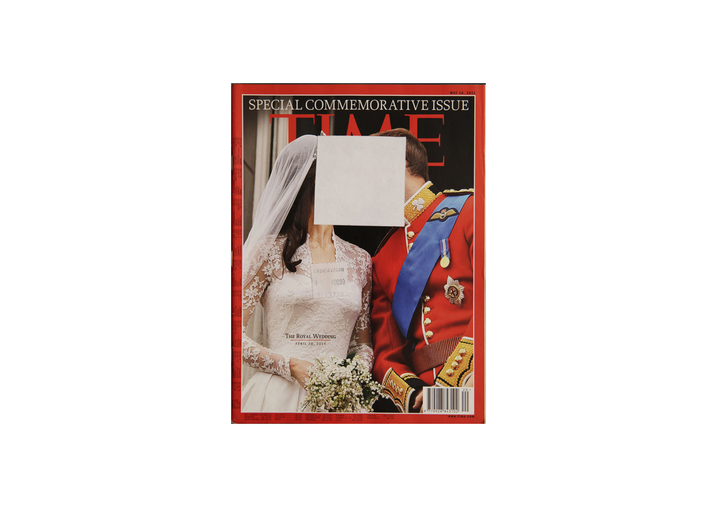
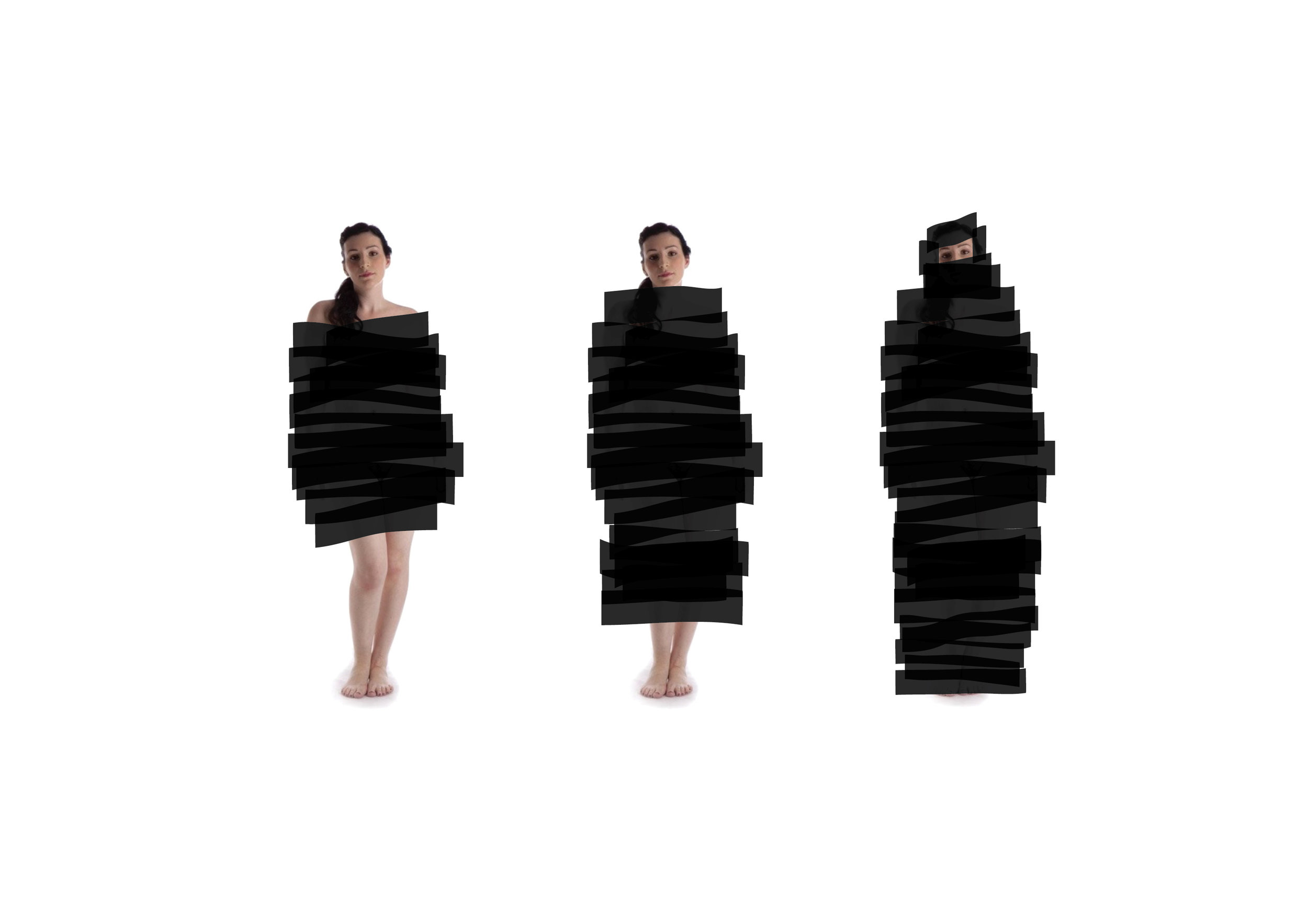
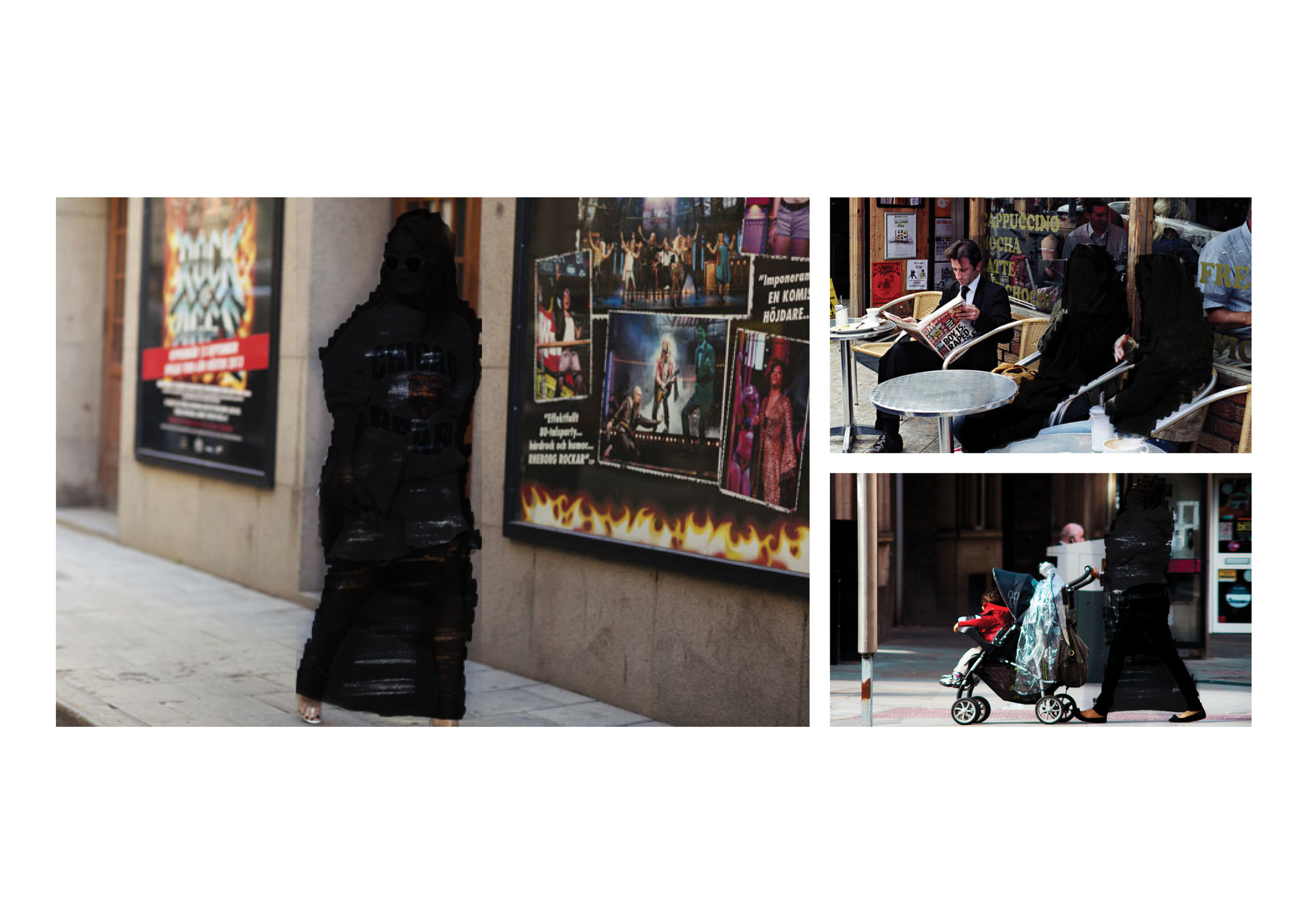
Women in the Middle East are physically and metaphorically censored out of society. So I designed a brand that aims to improve women’s situation in the Arab world by starting a conversation.
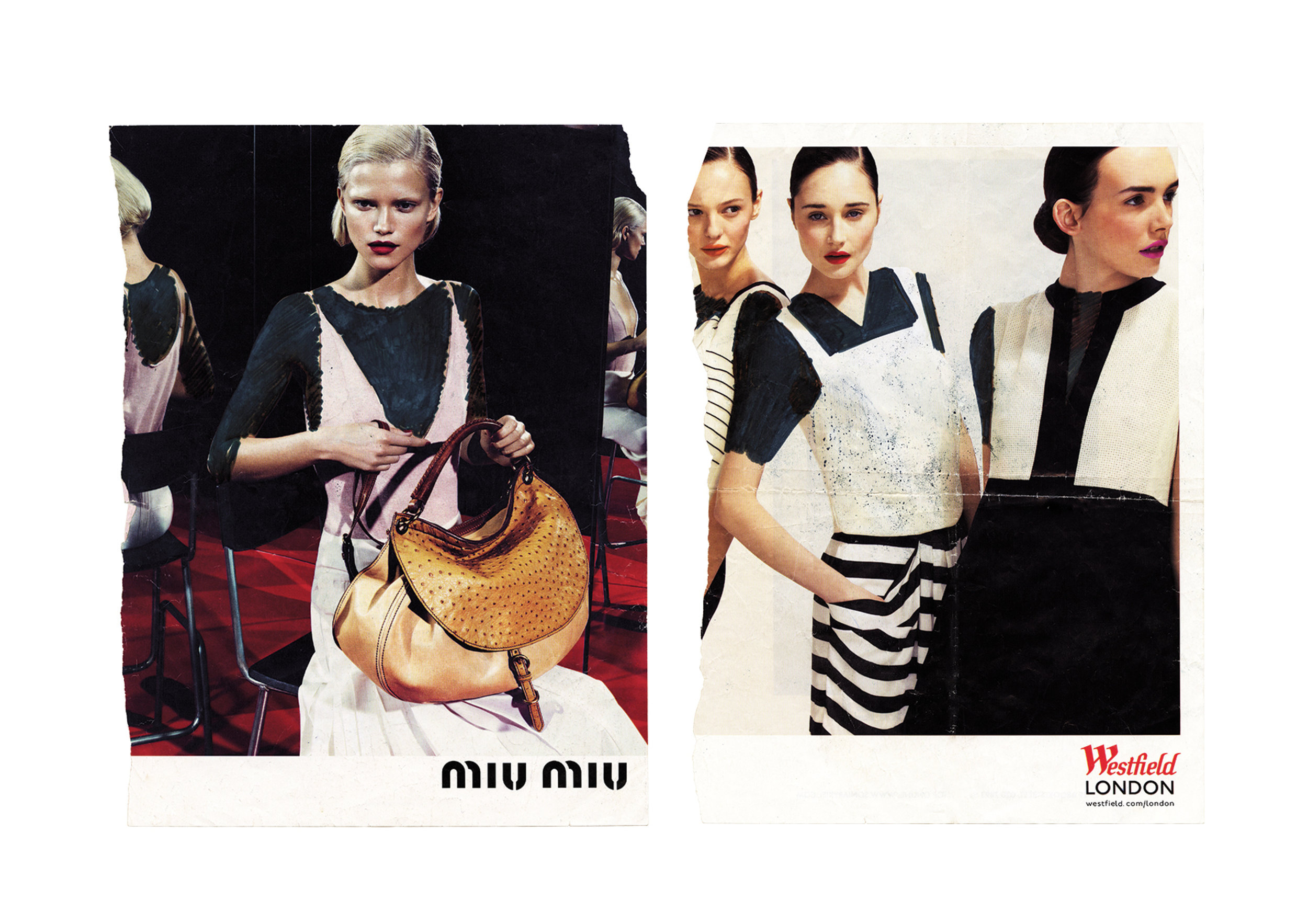
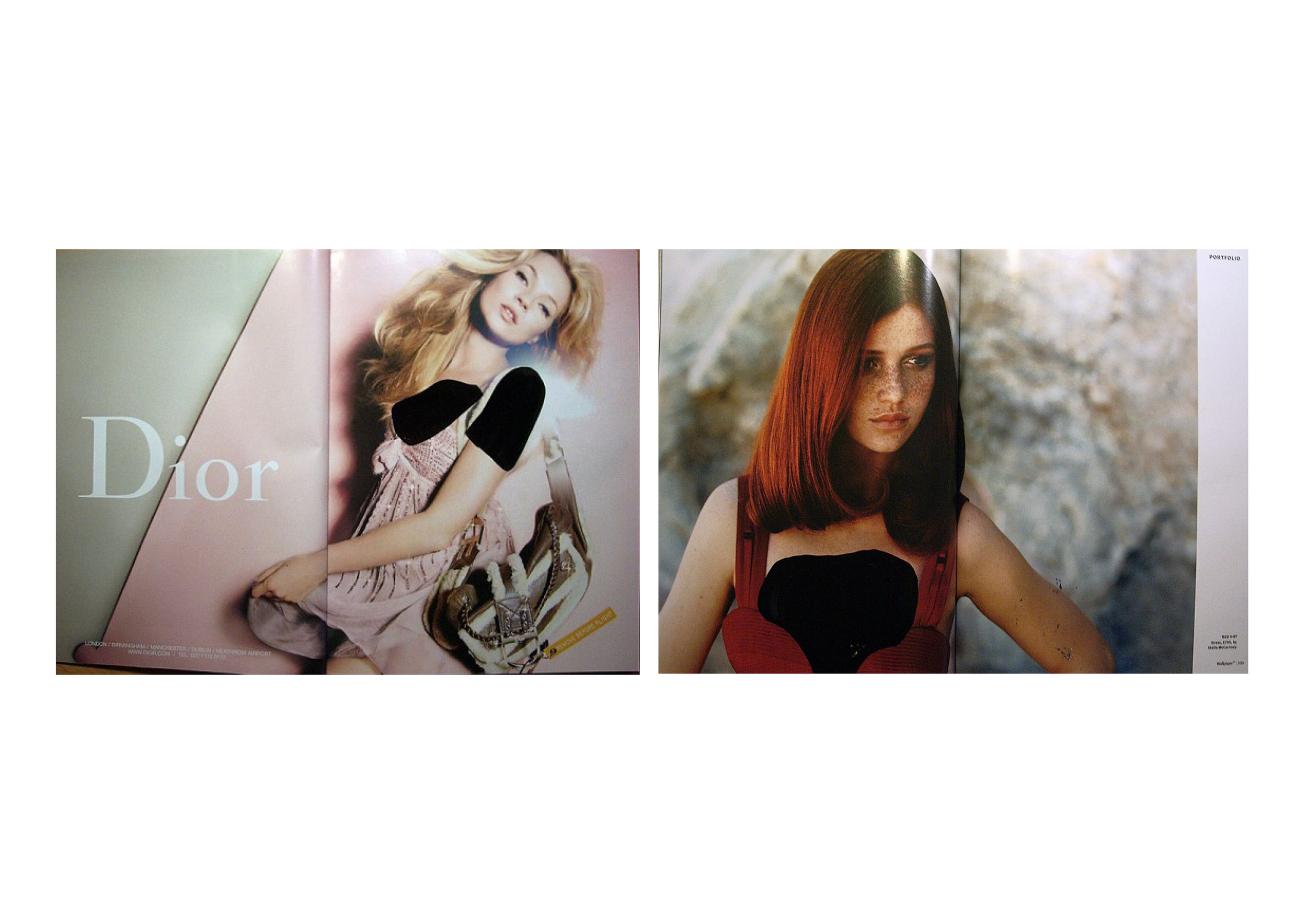
The first step is to make people aware of the extent to which women are controlled, through censorship, every day and in every aspect of their lives. The design of this brand uses graphic elements from censorship and hidden messages as devices to demonstrate this reality.
-
An MA Graphic Branding and Identity Project London College of Communication.
Course instructor Grant Rose
Research and experimentation

The Final Project
For the final project we were required to create a brand and an outcome of that brand. The identity is based on censorship. Not only are things hidden or crossed out, it also hides in plain sight. I called it 'Invisible Voices'.
The Brand
The brand is called ‘invisible voices’ because there is no such thing as an invisible voice. It isn’t silence, but you still can’t hear it. It represents the women that can’t be seen or heard. The brand aims at giving women their voice back and the name slightly changes depending on the medium used. The brand started with publishing, but it has the flexibility to branch out into other forms of expression in the future.
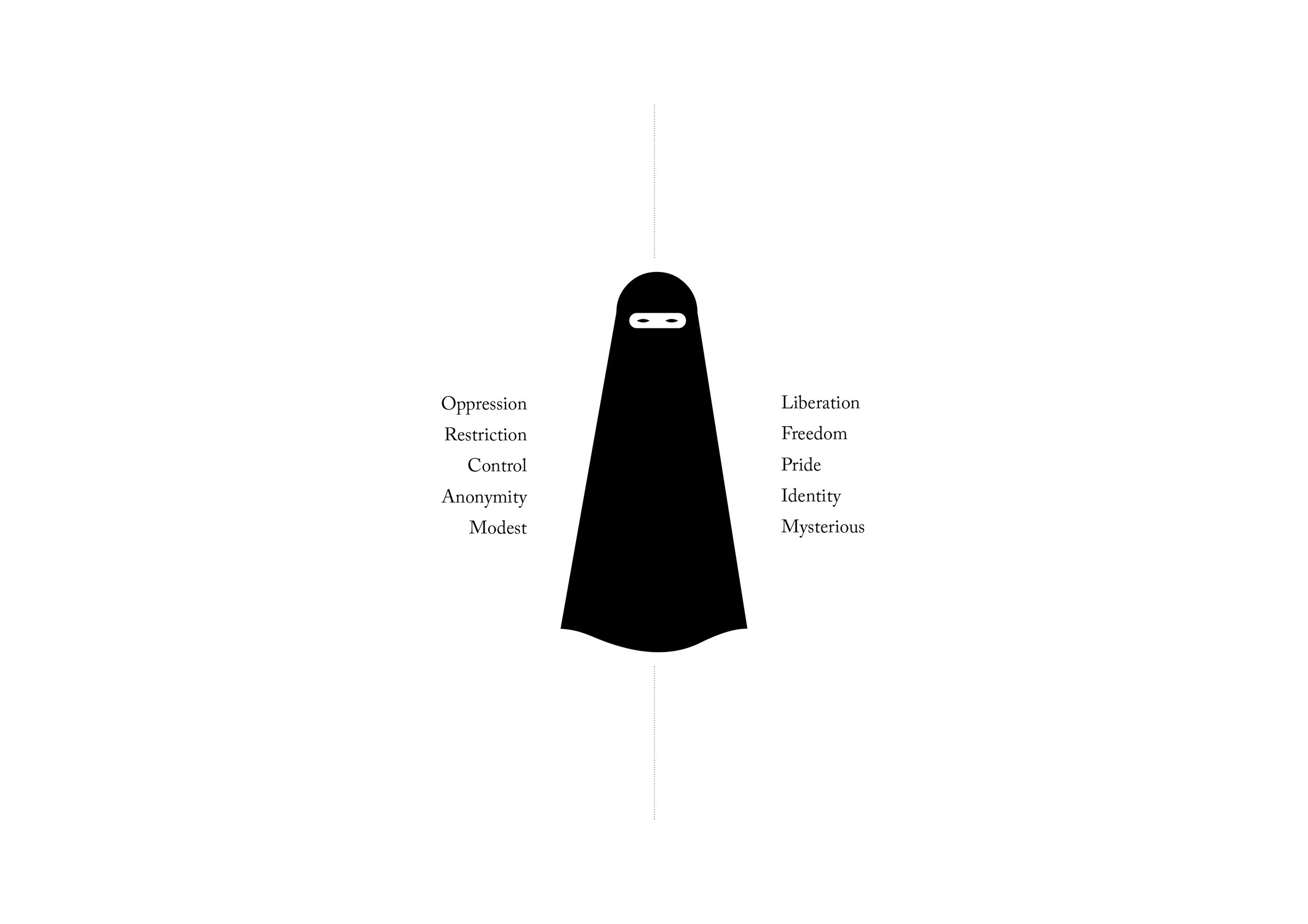
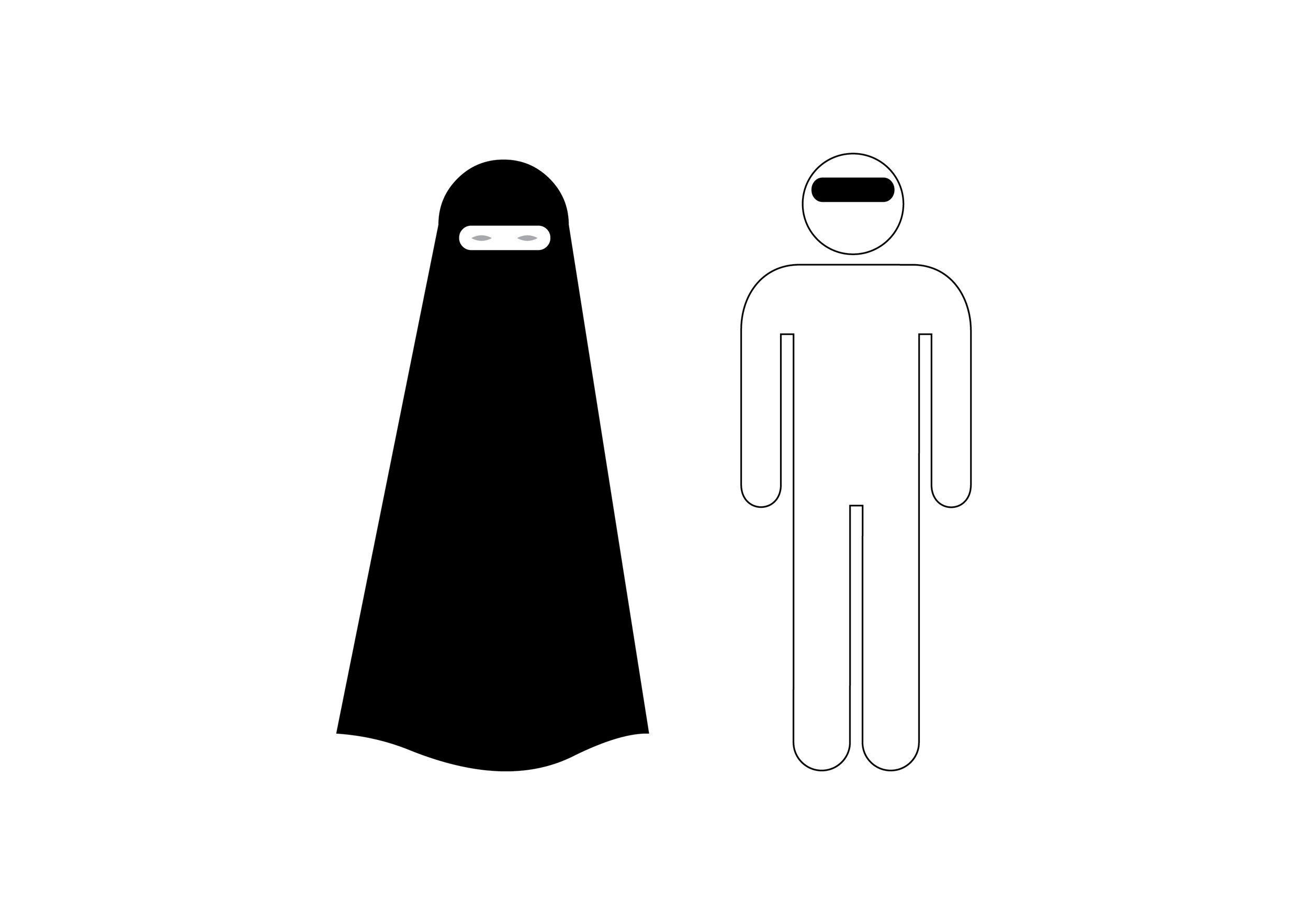
There was no doubt in my mind that the brand had to be black and white. Not only does black and white represent how men and women look, it also represents the clash between the two genders and the harsh reality of the situation.

Road signs are the inspiration for the brand’s visual language and fonts. Following road signs is not a choice, it’s a must. A set of rules and regulations, placed on societies by their governments. The logo is a combination between elements frequently used in government logos and road signs.

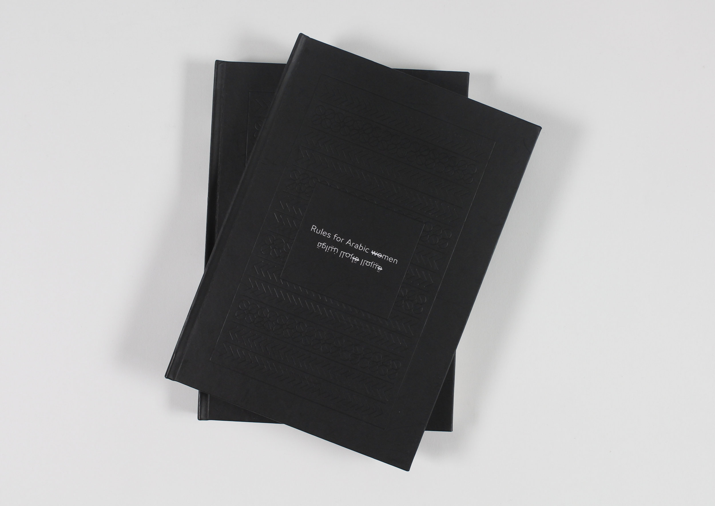
The Brand's outcome - a book of rules for Middle Eastern women
The invisible publishing books have to blend in and stand out at the same time. They have to have elements from traditional books with modern touches.
When I was a child, I remember looking through my father’s bookcase and seeing that most of the books were hardback with embossed covers and gold foil ornamented frames. The spines were very distinctive, and you could always tell which books were a series based on the spines. These books were written by male authors 99.9% of the time and even at a young age I remember knowing that these books were to be respected.
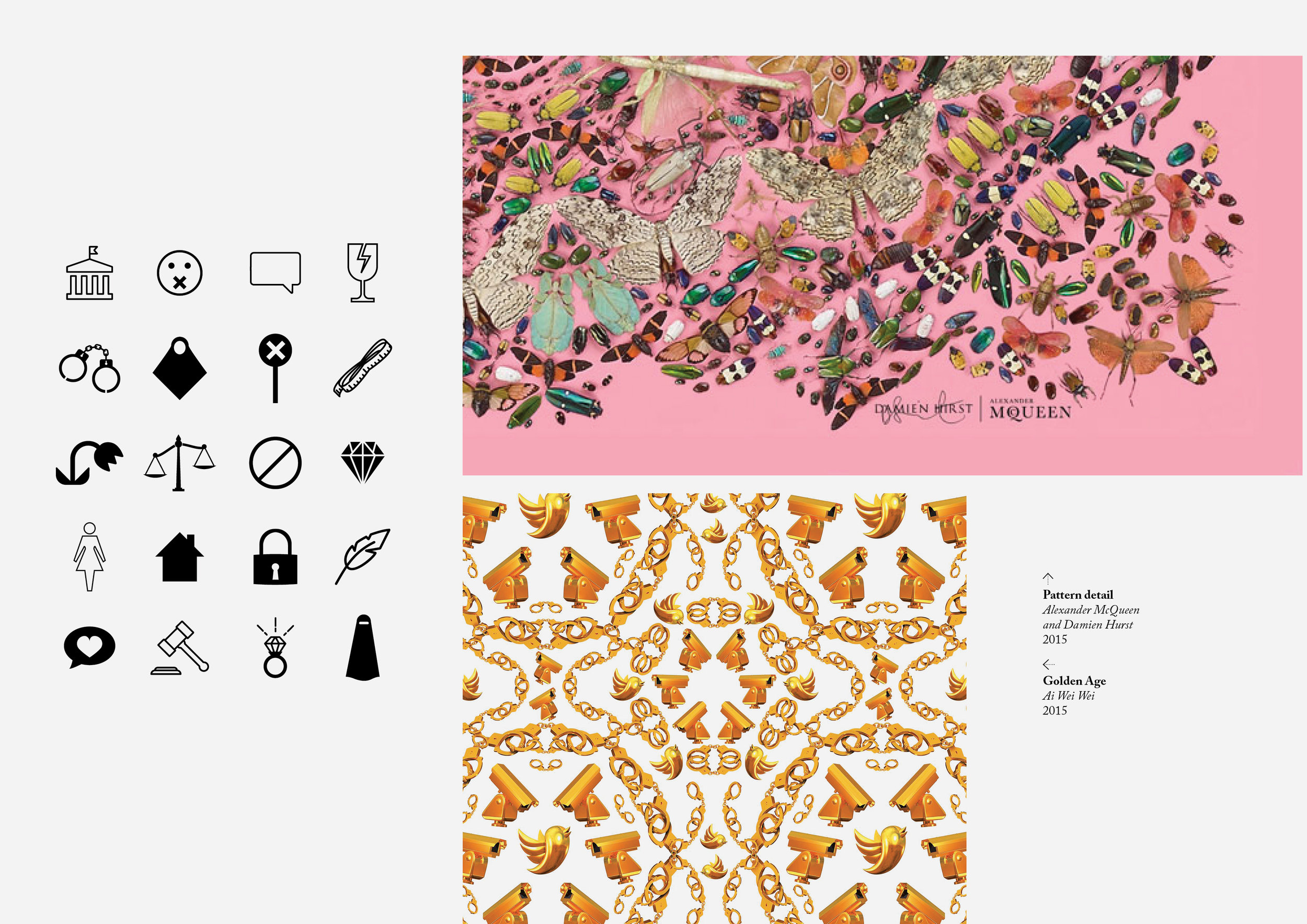
If all of the books used gold foil, one way to be different is to not use gold at all. A good balance is having the covers in black and white, while still maintaining the patterns and the emboss.
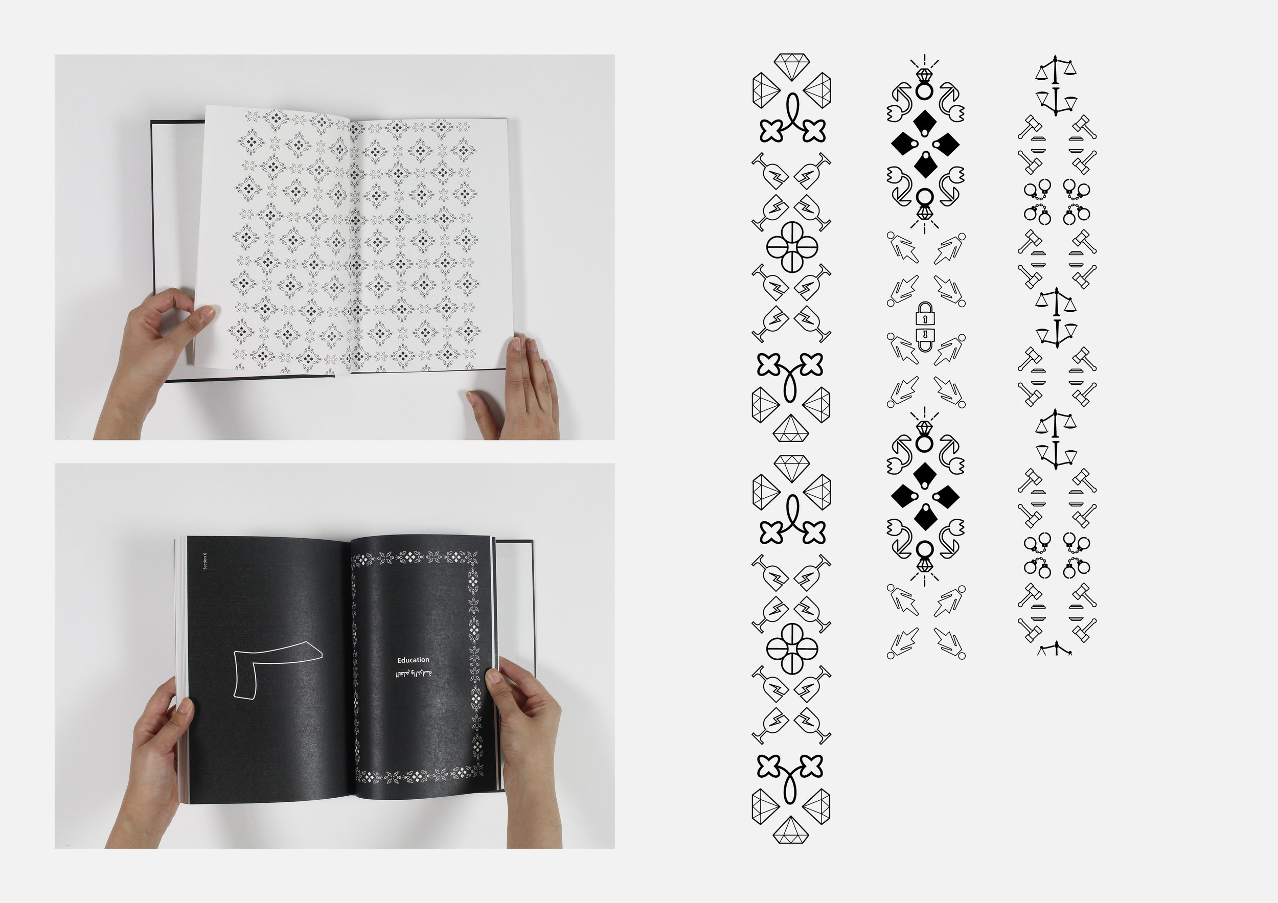
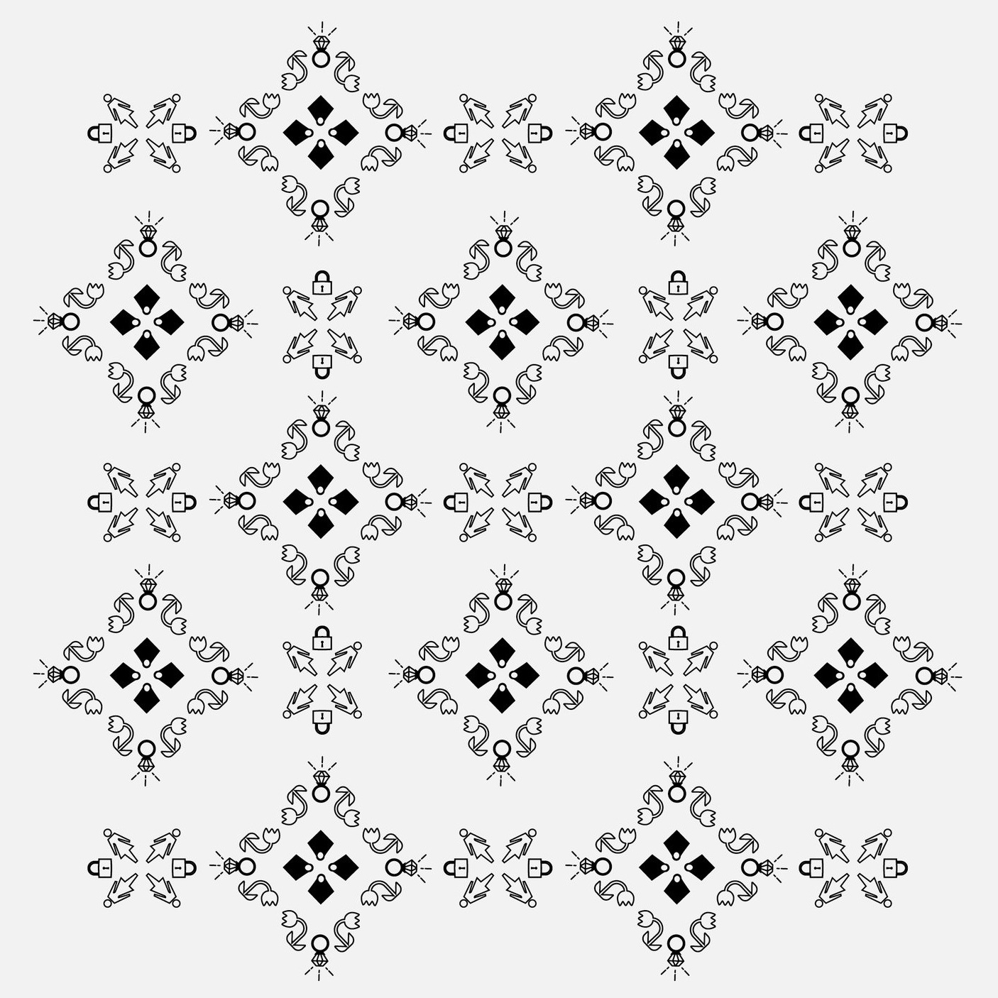
The emboss on the cover is a pattern created from road signs.

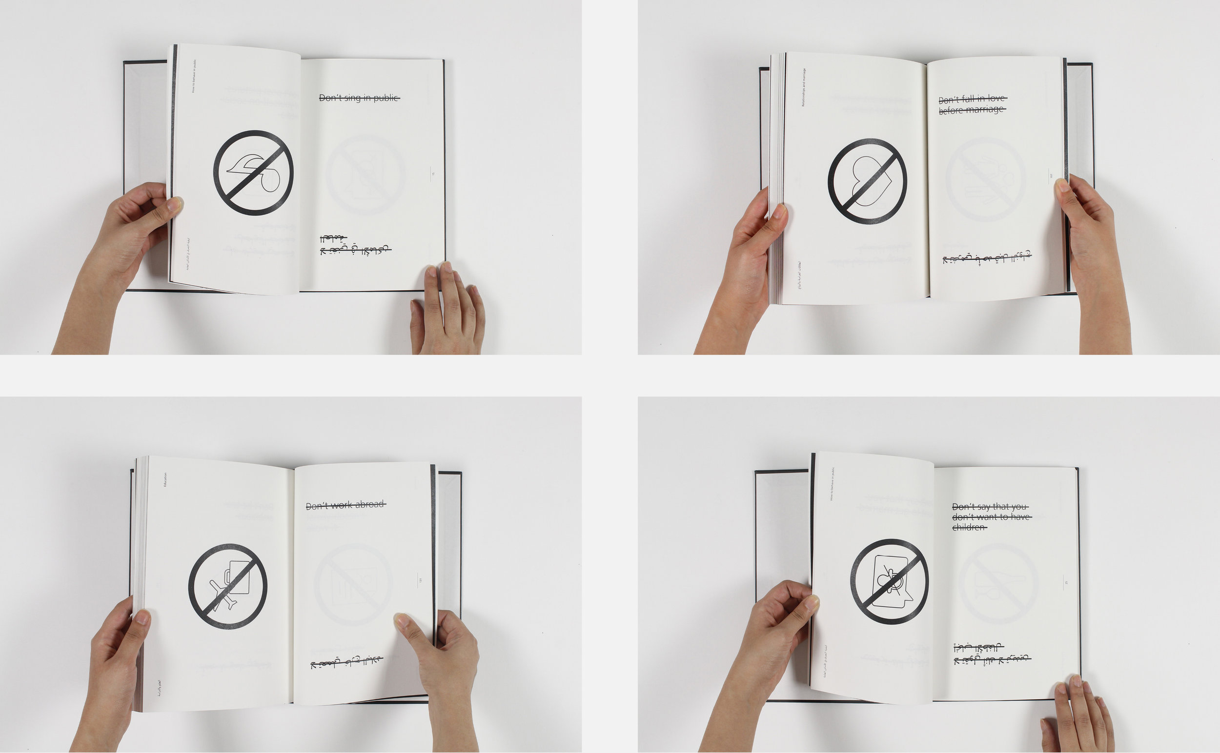
Each spread represents one 'rule' or cultural restriction enforced on Arabic women.


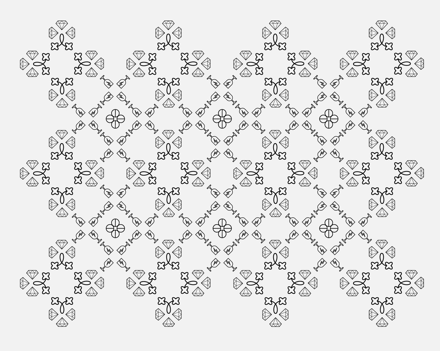
Arabic books usually use borders around chapter beginnings and I thought it would be interesting to create a pattern out of symbols related to oppression of women. For inspiration I looked at patterns created by Alexander McQueen and Ai Wei Wei. Their patterns are beautifully intricate, but upon closer examination you find that they are made up of skulls, razor blades, hand-cuffs, and dead insects, darkness hidden behind beauty.